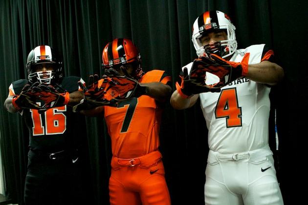
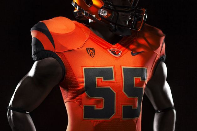
 Oregon State unveiled its new look on Monday, and hopefully Beavers fans are OK with change because this one was drastic.
No longer is Oregon State going to be somewhat drab, compared to other teams in college football at least. With the help of Nike, the Beavers have a bold new look with a redesigned mascot, and all of their sports teams will have a look that is a huge departure from what it had worn. Orange, black and white is about the only similarity.
Why did Oregon State overhaul its look? That's easy.
This rebranding is about 3 things. 1. Recruiting 2. Recruiting 3. Recruiting.Talking to you Class of 2014! #GoBeavs
— Mike Riley (@Coach_Riley) March 5, 2013
When your in-state rival is Oregon, you can't afford to be boring. And the Beavers' new look certainly isn't. It might take some time to get used to, but it seems like a big improvement. Here are some other pics from Oregon State's Facebook pages (be sure to notice the Bane-style face masks):


- - -
Want to join the conversation? Hit us up on Twitter @YahooDrSaturday and be sure to "Like" Dr. Saturday on Facebook for football conversations and stuff you won't see on the blog.
College basketball video from Yahoo! Sports:
Other popular content on Yahoo! Sports:
• Johnny Manziel drives away in a pretty sweet ride for an ESPN segment
• Forde Minutes: March begins with every team fighting for something
• Hunter Pence singing and dancing in his car might terrify you
• NBA Power Rankings: The Heat are back on top